Sunday, December 7, 2008

Mental Map


Franz Ackermann, an artist, sketches representations of what he sees on the ground level, the streets. He recreates a representation of the world being interconnected to each other. Using contemporary art to depict financial markets, information and transportation networks, social relationships, and so on.

Planimetric Map


Sanborn company used leading edge photogrammetric mapping tools to process data to create planimetric maps. This is a map of New York City's intersection of Beaver Street and New Street.

Topographic Map


A contour map using 1:4,800 scale, shading to show relief and contour lines to show elevation. The lines are very close which indicate steep slope rising from 4,500 ft. to 5,100 ft. On the top of the mountain it is flat--a plateau. This is Devil's Tower.

Thematic Map


A thematic map displays spatial pattern of a theme of attributes. This map shows USDA plant hardiness zone. There are different types of thematic maps, this map specifically is a dasymetric map of climate and plant hardiness defined with a key of different colors. John Snow was a thematic cartographer (cholera map 1855).

Cadasral Map


This is a comprehensive register of the metes and bounds of real property of a county. It is used to detail ownership. Cadastral Map overlaid on false colour composite of UMA Gani watershed, Chmur Taluk, Chandrapur District. This is using IRS_IC data on a scale of 1:4,000 to 1:8,000. Landsat and Spot satellites helped retrieve this image and data; its objective is land use.

PLSS


This is a public land survey system using cadastral information to depict Minnesota's PLSS base map. This is a small part of 1:100,000 scale of Worthington quadrangle. Each small box shows a quarter quarter section. Each number represents each quarter section quadrant and quarter quarter section quadrant. Townships and ranges are shown along with corresponding numbers.

Hypsometric Map


This is a measurement of height. The shaded relief plus hypsometric tints show shape and height of Las Bayas, Argentina using the Earth observatory elevation data.

Prapaganda Map


This is showing Anata, Jerusalem district. It shows the Apartheid Wall snaking through Jerusalem (red line) expect in reality that area, Abu Dis, is not included in Jerusalem.

Dot Distribution Map


This is showing the southeastern field cricket, grullus rubens. The dots show the county record and the dotted areas show likely distribution.

Choropleth Map


This is a type of thematic map usually to show population density or per-capita income. This is the Czech Republic population density per km^2.

Proportional Circle Map


This is showing magnitude and depth.

Isoline Map


An isoline map shows continuous joining points of the same value, for example equal altitude, temperature, barometric pressure, and wind speed. This isoline map shows the rainfall atop a Landsat image of Maui, Hawaii.

Flow Map


This uses hierarchical clustering given a set of nodes, positions and flow data between nodes. This shows the number of people in a migration.

Cartogram


This is a type of thematic map. It shows two types of are and distance. This is the "true" election results of 2008.

Statistical Map


This is Napoleon's Russian Campaign of 1812. It shows the army dwindling in green and the retreat in gold.

Cartographic Animation


This animation is of Hurricane Katrina on August 28, 2005.

Infrared Aerial Photo


This photo is of the Sacramento Deep Water Channel in California.

Black and White Aerial Photo


This photo is of White Lake, NC. A vacation spot to many families.

Doppler Radar


This shows the Slaton strom developing. It shows a developed tornado between 1:40 and 1:50 p.m.

Lidar


Lidar is light detection and ranging, this shows the World Trade Centers. It helps show were crews continue their recovery and cleanup efforts.

Isobars


Isobars show lines of constant pressure. This shows Europe and the Mediterranean barometric pressure in hectopascals (millibars).

Isotach


This isotach shows the 2003 Utah winter strom wind speed.

Isohyets


Isohyets show line joining of equal precipitation. This shows the Madison County rainfall.

Isopach


Isopaches show the strategic thickness of a rock unit as opposed to the true vertical thickness. This is showing isopach trends.

Isopleth


An isopleth shows the equal value of some variable at a given time and spatial area. This isopleth shows how acid rain affects areas.

DRG


This digital raster graphic shows the USGS digital GIS application for Alton.

DLG


This digital line graph shows vector representations of most of the features and attributes shown on USGS topographic maps. This is the three layers for USGS Bushkill, PA quadrangle. There are only three scales for these graphs:

small (1:2,000,000)

intermediate (1:100,000)

large (1:24,000)

DEM


This digital elevation model is showing the different elevations in southern Tunisia.

DOQQ


This digital orthophoto quarter quadrangle is showing 10 DOQQ's of Lake Travis.

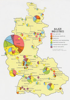
Continuously Variable Proportional Circle Map


The circles are in proportion to the variable being measured--this is showing the major industries in west Germany.

Classed Choropleth Maps


This choropleth map is investigating the quality of life in Brazil.

Bivariate Choropleth Map


This is showing two variables of population is 1997 and the median. It is shown with a variety of different color greens.

Univariate Choropleth Map


This map has one variable of Individuals in the U.S. This map is showing the percent of individuals in a given area.

Index Value Plot


FTAS Tracker (March 1995- Jan 2006) made an analysis of daily value relative to rolling (1-2 months) average, by date of month. These plots usually demonstrate current streamflow vs. historical.

Scatterplot


This scatterplot shows heart disease data from the UCI repository. You will notice there is more commonly heart disease in the older population than those in their early 30's.

Population Profile


This profile shows males vs. females of Coventry. A record of 300,848 people were surveyed.

Climograph


This climograph shows precipitation and temperature over a year's span in months.

Windrose


A windrose is used mostly by meteorologists to show how wind speed and direction are typically distributed at a particular location.

Star Plot


This shows the horizontally and vertically separated reservoirs in the Takula and Numbi fields in offshore Cabinda (1990).

Standardized Choropleth Map


This map shows the different populations of people 14 and under in Canada. A Standardized map allows comparison of distribution among different areas.

Unstandardized Choropleth Map


An unstandardized choropleth map shows no specific ran or class, very unordered. This map shows zip code demographic for various Hispanic groups.

Bilateral Graph


Regularly a bilateral graph shows increases on one side and decreases on another. In this graph it is shown people accepted as trainees, dispatch of experts, and dispatch of JOCVs (Japan Overseas Cooperation Volunteers).

Accumulative Line Graph of Lorenz Curve


This line graph shows the percents of income vs. the percent of households paired with a Lorenz Curve. It is conclusive that the Lorenz Curve shows inequality.

Triangular Plot


This plot was used to show the different voting streaks in April of 2005.

Parallel Coordinate Graph


This graph shows the coordinates of drosophila gene expression data exploration, which are small flies with two wings.

Histogram


This histogram represents error analysis in experimental physical science, similarly to a bar graph diagram.

Box Plot


This box plot represents the annual snow depth at a Mathsville Ski resort. It is symbolized with a lower quartile and upper quartile.

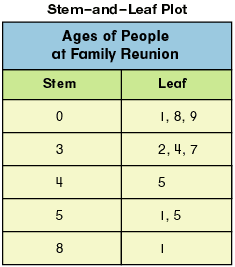
Stem and Leaf Plot


This stem and leaf plot is of the ages of people at a given family reunion. One column gives the stem figures and the other column gives the leaf figures.